Required knowledge level: expert
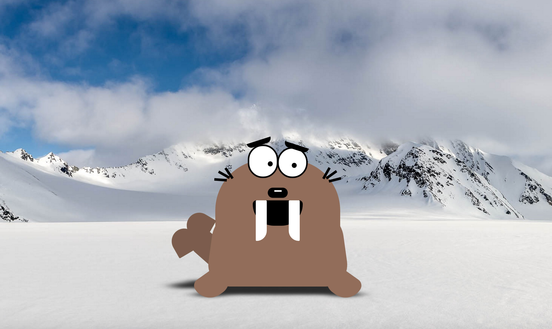
Walruses are my favorite animals, I just like how calm and friendly they are and it’s a shame that they are threatened with extinction due to water pollution and climate changes. One day when I had some free time I came up with the idea to build a cartoon-styled walrus using only HTML and CSS. I have never created a CSS animal before but since I kept on seeing pure CSS animals on Codepen or JSFiddle I wanted to give it a try. In this tutorial you will create an animated walrus using only CSS and HTML.
Preview
HTML5 responsive website
Download
Download it from GitHub
The difficulty of pure CSS objects
The difficulty when creating complex objects like animals with CSS is that you can not transform an HTML element to an extent that you could with for example SVG elements. When you build an object you need to create many HTML elements for all the different parts of the object. So let’s say you would like to build a human. You would then need to create HTML elements for the head, the eyes, each of the hairs etc. Furthermore in many cases you need multiple HTML elements to create one part of the object. So for example you would like the arm of the human to be bend in a specific way. Since we can not use paths in CSS we would need to create multiple HTML elements for different sections of the arm, adapt these elements with CSS and make sure they look like a bend arm when combined. Creating complex objects with SVG is definitely simpler and less pain.
Creating a sketch
Before we can begin to build the animal we need to create a sketch of the object. So either you are a very creative and artistic person who loves to draw cartoons then you can sketch your own object. Or you are just like me not the best cartoonist then you could check the internet for inspiring cartoons or cliparts and recreate an object with HTML and CSS. Note though that if you are using the clipart for something other than personal use you would need to make sure you don’t infringe somebody’s copyrights.
To find a suitable walrus I just went to Google and typed in “Walrus”. Then I got some real life images of walruses which is not what I wanted. So I went into the search options and chose the type to be “Clipart”. Now I got some really good results of cartoon-styled walruses. I chose one image which showed a cute cartoon illustration of a walrus without any colors.
Thinking in HTML – Creating the HTML code
The next step when creating a pure CSS walrus based on the illustration I chose above is to think in HTML. We need to convert the image into HTML and therefore create different div elements for the different parts of the object. It always makes sense to go from large to small so we start by adding the container of the whole object which then has all the other elements inside. We add a new div element and give it a class “walrus”. This walrus element should contain every part of the walrus, the body as well as for example a shadow below the animal.
Now that we have the most outer container of our walrus we need to have a look at the clipart image again and find out how we can further segment the walrus. It has a head containing the eyes, nose and mouth with tusks, some legs/fins and a tail fin. So we add a new HTML element as a container for our head, our legs and our tail. Now we go further into detail: the head contains hairs so we add a new “hairs” element and put one HTML element for each hair into that “hairs” element. The head also has two eyes so we add a container “eyes” and put two elements “eye” inside. It also has a mouth and a nose so we add elements for them as well into the “head”.
Into the legs we add two elements with the class “leg” for our two legs. The tail of the walrus is one of the most difficult parts and can not be created with CSS using only one single HTML element. So what I did is separating the tail into two fins.
Since we have some elements which are doubly present like the legs, the hair or the eyes I added a class “left” and “right” so that we can later position these elements on the left or right side.
This is the HTML code for the walrus that you should have now:
<div class="walrus">
	<div class="body">
		<div class="head">
			<div class="hairs">
				<div class="left">
					<div class="hair"></div>
					<div class="hair"></div>
					<div class="hair"></div>
				</div>
				<div class="right">
					<div class="hair"></div>
					<div class="hair"></div>
					<div class="hair"></div>
				</div>
			</div>
			<div class="eyes">
				<div class="left eye"></div>
				<div class="right eye"></div>
			</div>
			<div class="nose"></div>
			<div class="mouth"></div>
		</div>
		<div class="legs">
			<div class="left leg"></div>
			<div class="right leg"></div>
		</div>
		<div class="tail">
			<div class="fin"></div>
			<div class="fin"></div>
		</div>
	</div>
</div>
Styling the Walrus – Creating the CSS code
We have created the HTML code for our walrus, now we need to make this code visible. To make writing the CSS code as simple as possible I am using Stylus which is a CSS language built for Node.js. I used to work with Less and Sass however Stylus has some advantages and an even simpler syntax. In case you think you don’t need Less, Sass or Stylus you are right, you don’t need it to create the walrus but it will make things a lot easier and faster. The installation is very simple, you should definitely give it a try. Just install Node.js and then use the Node Package Manager to install Stylus.
In this tutorial I will not go deeply into detail about how and what CSS properties to use. You should have a look at the clipart image and think how you could recreate a certain part with CSS. You need to play around with the values and CSS properties to make an element look the way you want. You should use your browser’s developer console to change property values and see a live result. Some elements took me more time to realize because I had to do lots of adaptations until I was satisfied with the result. The most used properties when building CSS objects are probably border-radius, transform as well as sizing and positioning properties.

Creating the body
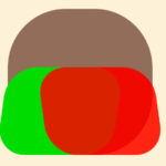
First of all let’s define some variables like the primary and secondary color and the border color. Next we begin adding CSS code to our .body element. This element should display the body of our walrus so basically the whole walrus but without legs, tail or head elements like eyes. As you can see on the clipart image the top part of the body is a bit like a halved sphere and then gets wider at the bottom. So one solution is to create a square for the body, then give it round borders and add pseudo-elements (:before and :after) to create the wider part at the bottom. Check out the image on the right to better understand how this can be done. To make the pseudo-elements skew you can use the transform property. This is the Stylus code I have for the body:
.body
    border-radius 100px
    width 250px
    height 250px
    background-color color-primary
    position relative
    &:after,&:before
      width 200px
      height 150px
      background-color color-primary
      display block
      content ''
      position absolute
      bottom 0
      left -10px
      transform skew(-8deg, 0)
      border-radius 50px
    &:after
      left auto
      right -10px
      transform skew(8deg, 0)
Creating the head
The head of our walrus contains two eyes with eyebrows, a nose and a mouth with two tusks. For the eyes we simply build two spheres and use the :before element to create a small black dot for the pupil. Using the :after pseudo-element we can then create a square, round off the borders and rotate it a bit using transform. And there we have an eyebrow.
The hair of our walrus can be simply created by setting a width and height as well as a position and rotation to each of the hairs.
For the nose we just create a rounded square, give it a black background and use a pseudo-element to also display a white shadow in the nose.
The mouth works in the same way. We just create a black square and set the border-radius for our top left and top right corner to a small value and for our bottom left and bottom right corners to a large value. That way we receive a smiling mouth.
The tusks are also just two squares with more border-radius on one side than on the other.
Positioning all the elements to the right spot is fairly simple, we just use absolute positioning and position an element pixel-precise to where we want.
Your Stylus code for the head should now look something like this:
.head
      .hairs
        position absolute
        top 0
        left 0
        width 100%
        .left
          .hair
            position absolute
            width 5px
            height 25px
            background-color border-color
            z-index -1
            &:nth-of-type(1)
              left 25px
              top 14px
              transform rotate(-35deg)
            &:nth-of-type(2)
              left: 15px
              top: 17px
              transform: rotate(-61deg)
            &:nth-of-type(3)
              left: 8px
              top: 27px
              transform: rotate(-86deg)
        .right
          .hair
            position absolute
            width 5px
            height 25px
            background-color border-color
            z-index -1
            &:nth-of-type(1)
              right 25px
              top 14px
              transform rotate(30deg)
            &:nth-of-type(2)
              right 15px
              top 17px
              transform rotate(55deg)
            &:nth-of-type(3)
              right 8px
              top 27px
              transform rotate(76deg)
      .eyes
        .eye
          background-color color-secondary
          position absolute
          border 3px solid border-color
          &.left
            left 65px
            width 55px
            height 60px
            border-radius 60px
            top -30px
            &:before
              position absolute
              width 10px
              height 10px
              background-color border-color
              border-radius 10px
              left 50%
              top 50%
              content ''
            &:after
              position absolute
              top -9px
              left -5px
              width 50px
              height 10px
              transform rotate(-15deg)
              background-color border-color
              content ''
              border-bottom-left-radius 50px
              border-bottom-right-radius 50px
          &.right
            right 65px
            width 55px
            height 55px
            border-radius 50px
            top -25px
            &:before
              position absolute
              width 10px
              height 10px
              background-color border-color
              border-radius 10px
              left 30%
              top 50%
              content ''
            &:after
              position absolute
              top -5px
              right -5px
              width 50px
              height 10px
              transform rotate(15deg)
              background-color border-color
              content ''
              border-bottom-left-radius 50px
              border-bottom-right-radius 50px
      .nose
        position absolute
        top 55px
        left calc(50% - 20px)
        width 40px
        height  20px
        border-radius 30px
        background-color border-color
        &:before
          position absolute
          top 5px
          left calc(50% - 7px)
          content ''
          background-color color-secondary
          width 15px
          height 3px
          border-radius 15px
      .mouth
        position absolute
        top 80px
        z-index 5
        left calc(50% - 50px)
        width 100px
        height 50px
        background-color border-color
        border-top-left-radius 15px
        border-top-right-radius 15px
        border-bottom-left-radius 90px
        border-bottom-right-radius 90px
        &:before
          position absolute
          content ''
          background-color color-secondary
          height 80px
          width 22px
          left 6px
          border-top-left-radius 5px
          border-top-right-radius 5px
          border-bottom-left-radius 5px
          border-bottom-right-radius 50px
        &:after
          position absolute
          content ''
          background-color color-secondary
          height 80px
          width 22px
          right 6px
          border-top-left-radius 5px
          border-top-right-radius 5px
          border-bottom-left-radius 50px
          border-bottom-right-radius 5px
Creating the legs
Creating the legs/fins of our walrus is quite simple. Just like before we define a width and height, set a background-color and adapt the border-radius for both our left and right leg separately. Then we just rotate the legs so that they look like on the clipart image.
Your Stylus code for the legs/fins should look like this:
.legs
      .leg
        background-color color-primary
        width 50px
        height 70px
        position absolute
        bottom -30px
        border-top 0
        &.left
          left -30px
          border-bottom-right-radius 50px
          border-bottom-left-radius 20px
          border-top-right-radius 40px
          border-top-left-radius 7px
          transform rotate(55deg)
        &.right
          right -30px
          border-bottom-right-radius 20px
          border-bottom-left-radius 50px
          border-top-right-radius 7px
          border-top-left-radius 40px
          transform rotate(-55deg)
Creating the tail fin
The tail of our walrus consists of one surrounding “tail” container and two “fin” elements. We use the “tail” container to position the tail at the right location. Then we can use the :after element to create a rounded square and rotate it until it sticks up a bit into the sky. Then we can create two rounded squares for our fins and rotate and position them corresponding to the clipart image.
The Stylus code for your tail fin could look like this:
.tail
      position absolute
      left -80px
      bottom 120px
      z-index -1
      transform rotate(15deg)
      &:after
        position absolute
        left 35px
        top 4px
        background-color #7a5d4d
        width 100px
        height 50px
        transform rotate(26deg)
        border-radius 90px
        content ''
      .fin
        position absolute
        background-color darken(color-primary,15%)
        width 50px
        height 50px
        border-top-left-radius 50px
        border-top-right-radius 5px
        border-bottom-left-radius 50px
        border-bottom-right-radius 5px
        &:nth-of-type(1)
          left 21px
          bottom -12px
          transform rotate(15deg)
        &:nth-of-type(2)
          transform rotate(45deg)
Bringing it to life – Animating the walrus
Your walrus should now look pretty cool already. You can add further improvements, add some more details or change some elements according to your liking. The bring our walrus to life we will now add some CSS animations to move elements like the eyes, eyebrows and the whole body. Once you have understood how to add animations to elements you can easily add more animations and even create a little story, for example the walrus watching a fish swimming by.
Let’s begin by making the walrus breath. This is the most important step when bringing it to life. To make it breath I chose to simply scale the walrus on the y-axis. The whole walrus scales up by 3 percent within two seconds and then scales back down to its original size. This makes it look like the walrus is actually breathing.
The code for this animation is simple. We just set the scaleY property to 1 at 0% and then set it to 1.03 at 50% (after 1 second). Also we set the transform-origin to center bottom in order for the scaling to take place to the top. The bottom is fixed and the walrus only scales up to the top.
@keyframes breath
  0%
    transform scaleY(1)
    transform-origin center bottom
  50%
    transform scaleY(1.03)
    transform-origin center bottom
To call the animation code we just add the animation property to the element we would like to be animated. In this case we can for example add it to the body of the walrus. The code for .body would then look like this:
animation breath 2s infinite ease-in-out
For the eye blinking all I did was add an animation that changes the background-color from white to black and back.
The eyebrow movement is done by using translateY to move the eyebrow up and down (faster than using top or bottom) as well as rotate to rotate the eyebrow a bit when moving up.
The pupil movement was also done using translate. I just moved the pupils around and using alternate inside the animation property I made sure the animation is also played backwards every odd time. That way the animation seems a bit more random.
This was my short tutorial on creating an animated pure CSS walrus. Have a look at the code on GitHub and try to use the concepts we talked about to build your own pure CSS object. I would love to see your creations so feel free to drop a comment with a link to your object (doesn’t have to be an animal). Thank you for reading!


