

Preview
HTML5 responsive website
Download
Download it from GitHub
In this quick Kube tutorial we will be creating a very simple yet modern and elegant personal portfolio website using Kube. Kube is a small CSS framework using the latest CSS techniques. The grid system is not using any floats but instead the new CSS flexbox which is already supported in current versions of all mayor browsers. In the future using flexbox will be the default way to create layouts in CSS and Kube is already starting now. Kube doesn’t include any JavaScript functionality like sliders, accordions etc. which might be missing features at first sight. But that is actually the strength of Kube because it is kept small and very basic without any fancy designs or features which would bloat the whole framework with stuff we don’t even need.
Getting Started
To begin we simply download the CSS framework by clicking the big blue button on Kube’s website. To get to know Kube a bit better you should look through the components section and check out all the components that come with Kube. Once you have downloaded the ZIP file open it up and you will see three things: a CSS folder containing a normal and a minified version of our CSS code, the index.html file and a folder called “Less” which includes less files. If you have never heard of less before be sure to read more about it here. We are going to work with those less files because it offers more functionality and is much more neat. As you can see we have many different less files for things like buttons, the grid system, alerts, forms etc. Be sure to check out those files and have a good look especially at the variables.less file since this file contains all our variables which we can adapt according to our needs.
The kube.css file inside the CSS folder contains the compiled CSS code of all the less files. You can compile the less files simply by compiling only the kube.less file which imports all other less files. To compile the kube.less file into the kube.min.css file you can simply run this command in your Terminal / Shell: lessc –clean-css kube.less ../css/kube.min.css.
Creating the header
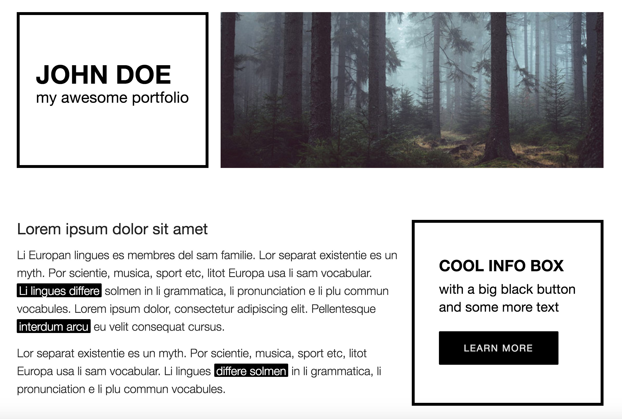
The header should contain an image of a landscape and some text in a frame next to it. To start let’s add an HTML5 header element into our code and have a look at the Kube grid system. Kube doesn’t use div elements as columns and rows but they use row and column tags which is pretty cool because it makes the HTML code better to read. So let’s add a row with two columns, one column should be three units wide and one column nine units wide. As you will see the columns will now fill up the whole browser width. So we need to add a container around our content, set its width too 100 percent (for smaller screens) and give it a maximum width (so that the website is not 100% wide on larger screens). For the header we now have the following code:
<div class="content">

<header>

<h1>Hello, world!</h1>

<row>

<column cols="4">4</column>

<column cols="8">8</column></row></header></div>
Now we want to set the width of .content to 100% and the maximum width to the variable @grid-width which you have most probably already discovered when you checked out the variables.less file 😉
You could either add your new less code to the existing files if they seem to fit to one of them. However you could also leave the files pretty much as they are and only add or edit rules when they really fit to the corresponding less file. So say you would like to add another type of button with a different color and size then it would be best to add this code into the buttons.less file. For rules which don’t really fit into an existing file you can create new files and add your custom rules in there. You can create new less files for different sections or areas. So you could for example add a less file for all the header styling and call it header.less. Then you could also create a file nav.less for the navigation, a file footer.less for the footer and a file main.less for our main content.
So let’s go into a less file you think fits well (for example a new file layout.less which contains basic layout rules) and create a new rule for .content setting the properties width and max-width. The problem when using the variable @grid-width now is that in the variables.less file no unit is defined for it. This was probably done to ensure the calculations made inside that file work. However even when adding px after the value the less compiler calculates correctly. So we can add the unit to the @grid-width and everything should work fine.
Now that .content takes care of limiting the maximum width of the page let’s also make sure the layer is aligned in the center. If you have a look at the helper.less file you will find several helper classes which are really useful in many cases. You will see that there is a class .centered which sets the margin to auto and thereby centers a block element. We can simply add that class to our .content element and it should be aligned in the horizontal mid of the page.
Next we should move our main heading h1 into the first column because that’s where we want to display the title of the page. The large right column should display an image as a background. So let’s move into our less code and start recreating our DOM tree in less. So we start by adding a rule for header into the header.less file. Inside the header rule we then nest a rule for row and inside that a rule for column. Let’s then set a height for our columns so that they are equally high. I have set it to 300px. To address each of the two columns you could either add two different classes to them in your HTML code or you could use the CSS3 nth-of-type() selector. So inside the column we can add two new rules, one for the first column (nth-of-type(1)) and one for the second column (nth-of-type(2)). Let’s try adding a black border to our first column. This should give us a great modern and minimalistic look. For the second column we would like to add an image as a background so could start adding a background-image property. However since we would like the website to look crisp also on retina devices Kube includes a great little mixin which takes care of setting the background-image to the retina version of an image on retina devices. You can find that mixin in the mixins.less file. To use it you can simply add .retina-image(‘../img/headerbg.jpg’,auto,auto); to your code. The first parameter defines the location of the non-retina image, the second parameter the width of the image and the third parameter the height of the image. The mixin will now use the file ../img/headerbg.jpg on non-retina displays. On retina displays the mixin will instead use the image ../img/headerbg@2x.jpg. So all you need to do is save your image once with a size of 750×300 pixels for non-retina devices and once with two times the size for retina devices (so 1500×600 pixels). Make sure the retina version of your image has the @2x notation at the end of the filename just before the file extension.
If you check out the page now you should see one column with a dark border and one column with an image. However the image is zoomed in way too much. The reason is that we have set the width and height of our image to auto so the image is as large as its natural dimensions. We would like instead to set its size to cover because that takes care of resizing the image always to the width and height of its parent container. So by setting the background-size to cover we can ensure that the image always fills out the surrounding container. Unfortunately there doesn’t seem to be a way to set it using the mixin so we need to add the property after the mixin and make sure it is applied by using !important.
Now let’s adapt our heading in the left column. Inside the h1 add your name. Now let’s also add a subheading. To do so put a span element into the h1 and display it as a block element in order for it to wrap to a new line. Inside that span you can then add text for the subheading. As you can see now the text is stuck to the top of the first column. What we would like to achieve is the text to be vertically and horizontally centered within the column. Thankfully Kube has a simple way to do that. In the mixins.less file you will find a mixin called .vertical-align(). All we need to do is add that mixin to our first column and our heading should be positioned in the middle of it. Next let’s change the font sizes for the heading and its subheading. So add h1 into the column in your header.less file and add span inside the h1. In the variables.less file you have a few different variables for different font sizes. You could either use one of them or create a new variable with a different font size as I did. Also play around with the line-height and use the baseline variables.
Your HTML code for the header should now look like this:
<div class="content centered">

<header>

<row>

<column cols="4">

<h1>

John Doe

<span>my awesome portfolio</span></h1></column>

<column cols="8"></column></row></header></div>
Your CSS code in the header.less file should now look something like this:
header
{
	row
	{
		column
		{
			height: 300px;
			&:nth-of-type(1)
			{
				border: 6px solid #000;
				.vertical-align();
				h1
				{
					font-size: @font-size-huge;
					font-weight: bold;
					text-transform: uppercase;
					line-height: @base-line-huge;
					span
					{
						display: block;
						font-size: @font-size-tiny;
						font-weight: 400;
						text-transform: none;
					}
				}
			}
			&:nth-of-type(2)
			{
				.retina-image('../img/headerbg.jpg',auto,auto);
				background-size: cover !important;
			}
		}
	}
}
Now that we have finished our header let’s move on to the next section. The next section will contain our main content so we will be using the main element. Inside that section I would like to have a large column on the left side with some text in it and a smaller column on the right side with an info box inside. The info box should have a black border just like in the header with some text and a large black button.
Let’s imagine the topic of both the text in the left column as well as the info box is similar, so they both deal with a specific topic. Let’s also imagine that one could take both columns out of their context and they would still make sense standing somewhere alone. If those two factors apply we can use the article element. So let’s add an article element into the main and add a row with two column inside.
You can now add whatever content you like into the columns. Just play around with some of the components you can find on Kube’s website. I decided for a paragraph with the class lead as some sort of heading and then a normal paragraph with some text below. Just for fun I also added mark elements – which I found here – around some words.
For the right column I simply copied the HTML code from our header and added a big black button into it which I found here. Also changing the heading from h1 to h2 does make sense since the heading is less important than our main heading in the header.
Note that every section in your HTML5 document needs to have a heading in order to have a proper HTML5 outline. Previously one was supposed to add a h1 heading into every section and the browsers and screen readers should have calculated the importance of a heading depending on where the heading stands in the document (how many parent sections exist). However the browsers never correctly calculated the document outline so from now on you should be using different headings for different priorities (h1 to h6). If you would like to find out more about it check this out.
Let’s add some CSS code to our article. First of all I would like to change the text color and background color of all the mark elements. To do so just go into your variables.less file and scroll down to the comment “Mark”. You will see two different variables, one for the text color and one for the background color. Just change the values to whatever you like and all mark elements will adapt. I also played around with the font sizes and line heights to make sure the text is not displayed too small.
The next thing I would like to change is the margins between some of the elements. I would like to move the button down a bit and add some space between the main section and the header. However instead of defining a margin for each element in CSS I would like to have some helper classes like .margin-top-20 which I can simply add to whatever HTML element I like and get a margin-top of 20 pixels. There is no built-in way to do this in Kube however we can create our own code and add it to for example the misc.less file. The following code consists of a loop which counts up from 0 to 100 in steps of 10 units and creates classes for margin-top, margin-right, margin-bottom and margin-left. I found this code snippet here and just changed it a bit. Thanks to this code we will now be able to set a margin to an element just by adding a class to it.
@from : 0; @to : 100; .loop(@index) when(@index =Next let's add a new section and give it a class so that we can address it better in Less. It should contain some images next to each others just like little blocks. Fortunately Kube comes with so called "Blocks" which you can use to add elements into a grid without having to create rows and columns. So simply copy the code from Kube's website and paste it into the new section. Add your images into the block elements and if you like wrap them by an anchor in order to make them clickable.
In your main.less file add the new section on the same level as the article from before. Then inside the section you can address only the section with the class .portfolio. I have added some simple yet stylish effect when hovering the images by simply adding a CSS3 brightness filter to the anchor elements. In order for the effect to slowly take place you can add a transition by simply calling the mixin .transition().
The portfolio section looks fine now but we still need to add one thing. As I have mentioned before each section needs to have a heading in order to result in a correct HTML5 outline. But we don't want to display a heading in our portfolio section since it wouldn't fit to the design. A proper outline however is important not only for screen readers but also for search engines to determine which sections contain what kind of content and to better understand the importance of a section. So the only way to add a heading to the code but not display it is to hide it. The best practice for hiding headings - also in order not to get punished by search engines - is by using the clip property like so:
position: absolute; clip: rect(1px 1px 1px 1px); /* IE6 & 7 */ clip: rect(1px, 1px, 1px, 1px);We can create a new class and call it .outline. Then we simply add this class to whatever heading we need for a proper outline but don't want to be visible when visiting the page. You can check yourself whether your page has a proper outline by using a HTML5 outline tool. Enter the code and hit "Outline This". In case you see "Untitled Section" you have forgotten to add a heading to a section.
Next let's add our last section which is the footer of the page. You should use the HTML5 element footer for this case. The footer should fill up the whole width of the browser so we can not add it into .content. Instead we just add it after .content. Inside the footer we only add a heading and a subheading just like in the sections before and a button. We want the text and button to be horizontally centered so we add the class .text-centered to the parent .row. For the button just play around with the different options listed on Kube's website.
Have a look at what you have created. Isn't it great how easy it was to build a website? You can experiment with the different variables and mixins and add some more Less code if something is not yet the way you like it.
In order to publish the site we just need to add html5shiv - a script which enables HTML5 in old IE browsers. Also we need to set all new HTML5 block elements to be displayed as block elements. If we don't explicitly set them to display:block they will not be recognized as block elements by Firefox reset.less file:
article, aside, details, figcaption, figure, footer, header, hgroup, main, menu, nav, section { display: block; }Congratulations! You have just finished building a website using Kube. Thank you for reading and feel free to leave a comment if you liked this tutorial.
Credit: all images are from Unsplash.it

5