

Required knowledge level: intermediate
In this responsive web design tutorial we will create an awesome responsive HTML5 website starting from scratch. I tried to include as many different features as possible, so we will be dealing with a jQuery slider, CSS3 transitions and animations, CSS Media Queries and so on. This part of the tutorial will show you the HTML structure and the required scripts in a step by step tutorial. The second part will then show you how to style it using CSS3 features to create this stunning HTML5 cross-browser responsive website.
Preview: Check out the result
Download: Get it from GitHub
Please note that this tutorial is made for people who already have an intermediate knowledge level. Some parts of the tutorial will not be described in detail as it is assumed that you know how to e.g. include a CSS file. If you have any questions you can always use the comment section and I will try to help you.
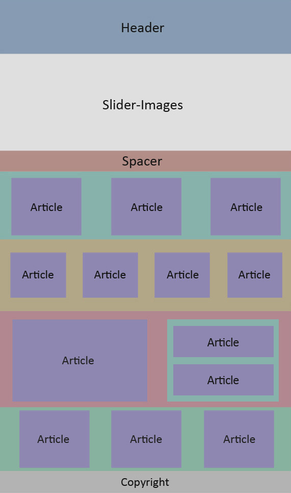
First of all let´s have a look at the basic structure of our website. Click on the image on the right side to see how our website will be arranged. I recommend to always draw a layout before starting to build a website. Having this overview of our structure will make it a lot easier to create the page.
Creating the head – Doctype and Meta Tags
Let´s begin by defining the HTML5 doctype and creating our head section with the required scripts and CSS files. The doctype declaration in HTML5 is fairly easy to remember compared to previous HTML/XHTML versions.
<!DOCTYPE HTML>
In our head section let´s set the charset to UTF-8 which is also easier now in HTML5.
<meta charset="UTF-8">
As we would like to create a responsive design which should work on all kind of devices and screen resolutions we need to add the viewport meta tag which defines how the website should be displayed on a device. We set the width to device-width and the initial scale to 1.0. What this does is set the width of the viewport to the width of the device and set the initial zoom level to 1.0. That way the page content will be displayed 1:1, an image with a size of 350px on a screen with 350px width would fill out the whole screen width.
<meta name="viewport" content="width=device-width, initial-scale=1.0"/>
Note that there are multiple different opinions about using initial-scale and width=device-width. Some people say not to use initial-scale at all as it might lead to incorrect behavior in iOS. In some cases a zoom bug occurs when rotating the device from portrait to landscape. As a result users have to manually zoom the page back out. Removing the property initial-scale might sometimes fix that bug. If it does not there is a script which disables the user’s ability to scale the page allowing the orientation change to occur properly.
However there are also people saying only to use initial-scale and not width=device-width. Raphael Goetter for example wrote in his blog post:
initial-scale=1.0 fits the viewport to the dimensions of the device (device-width and device-height values), which is a good idea because the size of the viewport fits the dimensions of the device regardless of its orientation.
width=device-width size the viewport to always corresponds to the (fixed value) width of the device, and thus is distorted in landscape orientation because que right value should be “device-height” not “device-width” in landscape (and it’s worse on iPhone5 whose device-height value is 568px, compared to its 320px device-width).
Therefore, I would rather recommend to use initial-scale alone, not associated width=device-width. Because the combination of the two is problematic, and moreover I think than even only width=device-width is problematic.
In conclustion there is no general instruction on which properties to use. You might first try to include both initial-scale and device-width. If that leads to problems in iOS or Android try removing either one of the properties. In case that still does not solve your problems try using the script I mentioned above until your responsive design is displayed correctly on all devices.
Creating the head – CSS files
In our website we will use four different CSS files. The first stylesheet is called reset.css. What it does is resetting the styling of all HTML elements so that we can start to build our own styling from scratch without having to worry about cross-browser differences. For this tutorial I used Eric Meyer’s “Reset CSS” 2.0, which you can find here.
The second stylesheet is called style.css and contains all our styling. If you want you can also divide this CSS file into two and separate the basic layout styling from the rest of the stylesheet.
If you look at the preview of our website and click on one of the small images in the main content section you will see that a larger version of the image will show up on top of the page. The script we use to achieve this is called Lightbox2 and is an easy way to overlay images on top of the current page. For this tutorial you will need to download Lightbox2 and include the CSS file “lightbox.css”.
The last stylesheet (Google WebFonts) will let us use the fonts Open Sans and Baumans. To find fonts and include them into your project visit Google Web Fonts.
Please note that when using multiple CSS and Javascript files the amount of HTTP requests increases which results in longer page loading time. For the live version of your website you could combine all CSS and Javascript files into a single one. If you know that you are not going to change your CSS code again then this would be a good solution. If you however want to be able to change your CSS and JS files from time to time I would recommend not to combine the files manually as this will probably make things confusing and more difficult to look through. You might rather want to use a minifier script which automatically combines, minifies and caches all your CSS and Javascript files into one single file. One of these scripts is called minify.js and can be found here.
Creating the head – Javascript / jQuery files
Now that we have included the CSS files let´s add all the required scripts. As we are using HTML5 and CSS3 features we need several scripts to make the features visible in all browsers. The first script we will be using is Modernizr.js, a feature detection library for HTML5 and CSS3. It let´s you easily detect whether a browser supports a specific feature or not. Modernizr.js also comes with html5shiv which enables HTML5 elements in Internet Explorer. To download Modernizr.js click here and click on the large “Build” button in the top right corner. Then click on “Download” next to “Build”.
The second script we need is Respond.js, a script which enables responsive design in Internet Explorer and other browsers which don´t support CSS Media Queries. Click here to download it from GitHub.
To be able to use i.e. lightbox.js we also need to include the jQuery library. The best way to do this is by letting Google host your jQuery file and use a fallback in case the Google jQuery file fails to load.
For Lightbox2 we need to include the lightbox.js located inside the js folder in the lightbox directory.
In this tutorial we will be using CSS3 features which require the use of different prefixes to work in all browsers. In order not to have to manually define the different prefixes each time we are using a CSS3 feature we will include the script Prefix Free, which automatically creates the required prefixes and let´s us write the unprefixed CSS properties. You can download the script from here.
The last script we will need is for the responsive Image Slider SlideJS. You can download the Plug-In from here and include the “jquery.slides.min.js” into your “js” folder.
Your file should now look like this. Note that in the course of this tutorial we will add further code to our head section.
<!DOCTYPE HTML>

<html>

<head>

<meta http-equiv="Content-Type" content="text/html; charset=utf-8"/>

<meta name="viewport" content="width=device-width, initial-scale=1.0"/>

<title>HTML5 responsive website tutorial</title>

<link rel="stylesheet" href="reset.css" type="text/css" media="screen" />

<link rel="stylesheet" href="style.css" type="text/css" media="screen" />

<link href="lightbox/css/lightbox.css" rel="stylesheet" />

<link href='http://fonts.googleapis.com/css?family=Open+Sans|Baumans' rel='stylesheet' type='text/css'/>

<script src="js/modernizr.js"></script>

<script src="js/respond.min.js"></script>

<!-- include extern jQuery file but fall back to local file if extern one fails to load !-->

<script src="http://code.jquery.com/jquery-1.7.2.min.js"></script>

<script type="text/javascript">window.jQuery || document.write('<script type="text\/javascript" src="js\/1.7.2.jquery.min"><\/script>')</script>

<script src="lightbox/js/lightbox.js"></script>

<script src="js/prefixfree.min.js"></script>

<script src="js/jquery.slides.min.js"></script></head>
Creating the body – Introduction
HTML5 offers several new elements which help us create more structured and accessible web pages. One of the main advantages of HTML5 is the possibility to structurize your web page and tell screen readers or search engine bots what is on a page which helps them to read only the parts they want.
Before we start coding let´s first have a look at the most important new sectioning elements in HTML5.
The new section element defines a part of a website with related content. It should not be used as a generic container element or for pure styling purposes. In that case rather use a simple div.
An article defines an independent piece of content which should be able to stand alone and still make sense.
A header defines a header for a document or a section.
A footer is used for defining the footer of a document or a section.
A nav defines a set of navigation links which should be the main navigation of your website.
An aside defines a section with secondary content. If an aside is placed within an article the content should be related to that specific article. If it is placed outside an article the content should be related to the site as whole.
Each of the sectioning elements in HTML5 should almost in any case contain a heading. By giving each section a specific heading you are creating a new section in the HTML5 outline. This is important as a proper outline does not only improve accessibility but is also good for SEO. To create a correct HTML5 outline you can use the Outliner Tool. In case you see an “Untitled Section” which corresponds to a section element in your HTML code you might want to specify a heading for the section. For further information on the document outlining algorithm be sure to check out Derek Johnson´s blog post.
If you have a look at the website we will be creating you will probably think: “Didn´t he just say that we need a heading for each sectioning element? I don´t see any heading for the header, the navigation, the footer or some of the sections.”. Obviously displaying a heading for each of the sectioning elements does not really make any sense.
On the other hand we need to define headings for every section to create a proper outline. Not using sections in our document at all would somehow destroy the whole purpose of a HTML5 structured document.
A solution for this is to add headings for each section into your HTML code and then hide them with CSS. You should not hide them with display:none though as this would also remove them from the outline. Rather use the CSS property clip to hide the headings which is also the best way not to get banned by search engines for hiding content. If you would like to read more about it check out this answer.
Creating the body – Building the website structure
Let´s start creating the HTML5 elements on the basis of our layout overview (click here to open the structure image in a second tab so you can switch between tabs while coding).
The first thing we need is a header. The header will include our navigation and our logo. Inside the header we put the main heading h1 and a paragraph. The main heading could be your website´s name or logo and the paragraph a motto or phrase describing the website. Depending on whether the subheading contains the main keywords and is an important part of the site you might in some cases also use a h2 instead. Apart from the heading and the paragraph let´s also put our navigation into the header. Inside the navigation section we put an unordered list with all the navigation links as list items. Your header code should now look like this.
<header>

<h1>Lingulo HTML5</h1>

<p>A responsive website tutorial</p>

<nav>

<ul>

<li><a href="javascript:void(0)">Home</a></li>

<li><a href="javascript:void(0)">Porfolio</a></li>

<li><a href="javascript:void(0)">About</a></li>

<li><a href="javascript:void(0)">Contact</a></li></ul></nav></header>
On the website structure image the next area below the header is called “Slider-Images”. As you can see when you look at the preview of our website this area will contain a large jQuery image slider which changes the image every 6 seconds. There are plenty of jQuery Sliders out there but in this tutorial we will use the responsive slideshow plug-in SlideJS which you should download now.
As you can see in the example files of SlideJS the Slider needs a new div called “slides” which contains the images you want to be slided. As we are going to show content boxes on top of the images we will wrap the div “slides” into a new section “container” and add the content for each image into a separate article which we call “slider_content1”, “slider_content2”, “slider_content3″… We are using IDs instead of classes here because we want to address each article with jQuery later on and need to be sure that each one appears only once on the page. The reason why we used articles for the first three sections and then a simple div for the slides is that the articles contain our independent content while the div only contains our three slider images and mainly has a styling purpose. If you are looking for royalty-free images that you can use in your web project please visit Open-Image.net.
<section class="container">

<h2 class="hidden">Lorem Ipsum</h2>

<article id="slider_content1"></article>

<article id="slider_content2"></article>

<article id="slider_content3"></article>

<div id="slides">

<img src="img/slide1.jpg" alt="Some alt text">

<img src="img/slide2.jpg" alt="Some alt text">

<img src="img/slide3.jpg" alt="Some alt text"></div></section>
Now let´s add the slider content into our markup. “slider_content1” will be the content which is shown when the image “slide1.jpg” is displayed, “slider_content2” for “slide2.jpg” and so on. Inside these articles let´s add a heading, some teaser text and a read-more link. Note that we also add a heading with a class “hidden” into the section as we want to create a proper HTML5 outline. If you have problems deciding which heading to use on your website my recommendation is to try to use a heading structure with elements of the appropriate rank for the section’s nesting level. Read this article if you would like to know more about proper use of headings in sections. You´re whole code for the slider should now look like this (I added some blind text into headings and paragraphs).
<section class="container">

<h2 class="hidden">Lorem Ipsum</h2>

<article id="slider_content1">

<h3>Lorem ipsum dolor?</h3>

<p>Weit hinten, hinter den Wortbergen, fern der Länder Vokalien und Konsonantien leben die Blindtexte. Abgeschieden wohnen Sie in Buchstabhausen an der Küste des Semantik.</p>

<a class="button" href="some_page.html">Mehr lesen</a></article>

<article id="slider_content2">

<h3>Nulla consequat</h3>

<p>Ein kleines Bächlein namens Duden fließt durch ihren Ort und versorgt sie mit den nötigen Regelialien. Es ist ein paradiesmatisches Land, in dem einem gebratene Satzteile in den Mund fliegen.</p>

<a class="button" href="some_page.html">Mehr lesen</a></article>

<article id="slider_content3">

<h3>Lorem ipsum</h3>

<p>Nicht einmal von der allmächtigen Interpunktion werden die Blindtexte beherrscht – ein geradezu unorthographisches Leben.</p>

<a class="button" href="some_page.html">Mehr lesen</a></article>

<div id="slides">

<img src="img/slide1.jpg" alt="Some alt text">

<img src="img/slide2.jpg" alt="Some alt text">

<img src="img/slide3.jpg" alt="Some alt text"></div></section>
Now that we have the HTML structure of the image slider let´s move on to the next element on our structure image. As you can see the next thing to do would be the spacer. I called it spacer although it is not actually a spacer, it is just some orange part below the image slider with a short sentence and a search field. For the spacer we use a new section with the ID “spacer”. The reason I used an ID instead of a class for all the sections on the website is that I would like to be able to directly link to a specific part of the website (e.g. http://www.lingulo.com/tutorial-content/html5/#spacer directly scrolls down to the spacer). Inside the spacer we put a short sentence into a new paragraph and another div with the class “search”, which contains our search form.
<section id="spacer">

<h2 class="hidden">Dolor sit amet</h2>

<p>Lorem ipsum dolor sit amet, consectetuer adipiscing elit?</p>

<div class="search">

<form action="#">

<input type="text" name="sitesearch" value="Enter a word..."/>

<input type="submit" name="start_search" class="button" value="Search"/></form></div></section>
You are doing great, we already have almost half of the whole HTML5 code we need. Take a look at the structure image again. You can see that from now on we have almost only “articles”, which are wrapped inside containers.
Let´s continue with the next section which contains three articles with a heading and an icon next to it. The icons I used in my tutorial are from Visualpharm and can be found here. Also add a heading h3 and a paragraph p with some text to the articles. The br class=”clear” is used to clear the floating of the three articles which we will add into our CSS file in the next part of this tutorial.
<section id="boxcontent">

<h2 class="hidden">Adipiscing</h2>

<article>

<img src="img/some_icon.png" alt="alt text"/>

<h3>Lorem ipsum</h3>

<p>

Eines Tages aber beschloß eine kleine Zeile Blindtext, ihr Name war Lorem Ipsum, hinaus zu gehen.</p></article>

<article>

<img src="img/some_icon.png" alt="alt text"/>

<h3>Consectetuer</h3>

<p>

Der große Oxmox riet ihr davon ab, da es dort wimmele von bösen Kommata, wilden Fragezeichen...</p></article>

<article>

<img src="img/some_icon.png" alt="alt text"/>

<h3>Dolor sit amet</h3>

<p>

Es packte seine sieben Versalien, schob sich sein Initial in den Gürtel und machte sich auf den Weg.</p></article>

<br class="clear"/></section>
Now let´s create our next section again with a h2 heading and four articles in it. Inside the articles we put a hidden heading h3 and a new HTML5 element called figure. The figure element is used in conjunction with the figcaption element to mark up images or diagrams (among others) and should be an independent part which can be moved away from the main flow of the document. Create a figure element and add an image and a figcaption to it.
If you move your mouse over the images in the website preview you will see that they will become dark and there will be a magnifier icon on top. When clicking on an image Lightbox2 will open the image up in a larger version. We have already included the Lightbox2 script into our head part. To enable image resizing we now need to create an anchor around our image and give it the attribute rel=”lightbox”. The href attribute should point to the large image version.
The effect with the magnifier icon on mouse hover is created purely with CSS3 features. The HTML element used to create the half transparent black layer is a span element wrapped inside the anchor. We will style the span in the second part of this tutorial to make it invisible by default and only show it on mouse hover.
Your code for the section “four_columns” should look like this.
<section id="four_columns">

<h2>

Lorem ipsum</h2>

<article class="img-item">

<h3 class="hidden">Dolor sit amet</h3>

<figure>

<a href="img/example-slide-1.jpg" rel="lightbox" title="Some Title">

<span class="thumb-screen"></span>

<img src="img/example-slide-1sml.jpg" alt="Some alt text"/></a>

<figcaption>

<strong>

Photo by: Some Name</strong>

Als es die ersten Hügel des Kursivgebirges erklommen hatte</figcaption></figure></article>

<article class="img-item">

<h3 class="hidden">Sit Amet</h3>

<figure>

<a href="img/example-slide-2.jpg" rel="lightbox" title="Some Title">

<span class="thumb-screen"></span>

<img src="img/example-slide-2sml.jpg" alt="Some alt text"/></a>

<figcaption>

<strong>

 Photo by: Some Name</strong>

warf es einen letzten Blick zurück auf die Skyline seiner Heimatstadt Buchstabhausen</figcaption></figure></article>

<article class="img-item">

<h3 class="hidden">Dolor Sit</h3>

<figure>

<a href="img/example-slide-3.jpg" rel="lightbox" title="Some Title">

<span class="thumb-screen"></span>

<img src="img/example-slide-3sml.jpg" alt="Some alt text"/></a>

<figcaption>

<strong>

Photo by: Some Name</strong>

die Headline von Alphabetdorf und die Subline seiner eigenen Straße.</figcaption></figure></article>

<article class="img-item">

<h3 class="hidden">Lorem Ipsum</h3>

<figure>

<a href="img/example-slide-4.jpg" rel="lightbox" title="Some Title">

<span class="thumb-screen"></span>

<img src="img/example-slide-4sml.jpg" alt="Some alt text"/></a>

<figcaption>

<strong>

Photo by: Some Name</strong>

Wehmütig lief ihm eine rhetorische Frage über die Wange.</figcaption></figure></article>

<br class="clear"/></section>
Next thing we need is another section with a hidden heading, an article and another section in it. The second section contains a hidden heading and two articles which each contain also a hidden heading. Give the outer section an ID, for example “text_columns” and each of the columns a class, for example “column1” and “column2”. We could of course also not use classes and address the article and section directly. The reason I like to use classes though is that it makes it easier in case you want to change the HTML code later on without having to change the CSS code.
Inside the first column put a heading h3 and a paragraph p with some text. Into the second column we will put two articles or divs depending on whether the content is relevant and independent or not. Inside each of these two wrappers add a paragraph p and an image. The images need a class “rocket” and “clock” and will be animated later on in the second part of this tutorial.
<section id="text_columns">

<h2 class="hidden">Blindtext</h2>

<article class="column1">

<h3>

Dolor sit amet</h3>

<p>Unterwegs traf es eine Copy. Die Copy warnte das Blindtextchen, da, wo sie herkäme wäre sie zigmal umgeschrieben worden und alles, was von ihrem Ursprung noch übrig wäre, sei das Wort "und" und das Blindtextchen solle umkehren und wieder in sein eigenes, sicheres Land zurückkehren.</p>

<p>Doch alles Gutzureden konnte es nicht überzeugen und so dauerte es nicht lange, bis ihm ein paar heimtückische Werbetexter auflauerten, es mit Longe und Parole betrunken machten und es dann in ihre Agentur schleppten, wo sie es für ihre Projekte wieder und wieder mißbrauchten.</p></article>

<section class="column2">

<h3 class="hidden">Lorem Impsum</h3>

<article class="row">

<h4 class="hidden">Dolor sit</h4>

<img src="img/icon.png" width="80" class="rocket" alt="Some alt text"/>

<p>Und wenn es nicht umgeschrieben wurde, dann benutzen Sie es immernoch.</p></article>

<article class="row">

<h4 class="hidden">Ipsum</h4>

<img src="img/icon.png" width="80" class="clock" alt="Some alt text"/>

<p>Doch alles Gutzureden konnte es nicht überzeugen und so dauerte es nicht.</p></article></section></section>
We have already reached the footer of our website. Into the footer we are going to put not only a hidden heading and a section with three articles for the upper three columns of the footer but also another section with the ID “copyright” which we are going to position at the bottom of our footer later in the second part of this tutorial. Into the “copyright” section we add a div with the class “wrapper” which will make sure the content is centered and does not exceed the maximum width (we are going to talk about that in the second part more detailed). The reason we are using a div here instead of an article is that in this case all we need is a container for styling purposes, there is no actual related and independent content inside. Into the “wrapper” div we put a copyright note as blank text and another div with the class “social” which contains all the social links.
The section which we just created at the beginning of the footer again gets a hidden heading and contains three articles with the class “column”. To the second and third article we need to assign another class so we can later on target each article separately in CSS. Add the class “midlist” to the second article and the class “rightlist” to the third one. To do so simply add a blank space after “column” and put the other class behind (<article class=”column midlist”>). Into the articles we need to add some content, into the first one let´s just put a heading and a text. Into the one in the middle and the one in the right also put a heading and an unordered list with a link inside each of the list items. Each link should be wrapped around an image and a span element. The span contains our text that we want to display. We are using a span to be able to position the text in any way we want and display it as a block element (more about that later).
<footer>
<h2 class="hidden">Our footer</h2>
<section id="copyright">
<h3 class="hidden">Copyright notice</h3>
<div class="wrapper">
<div class="social">
<a href="javascript:void(0)"><img src="img/Social-Networks-Google-plus-icon.png" alt="google plus" width="25"/></a>
<a href="javascript:void(0)"><img src="img/Logos-Tumblr-icon.png" alt="tumblr" width="25"/></a>
<a href="javascript:void(0)"><img src="img/Logos-Youtube-icon.png" alt="youtube" width="25"/></a>
<a href="javascript:void(0)"><img src="img/Social-Networks-Bebo-icon.png" alt="bebo" width="25"/></a>
<a href="javascript:void(0)"><img src="img/Social-Networks-Xing-icon.png" alt="xing" width="25"/></a></div>
© Copyright 2012 by <a href="http://www.lingulo.com">Lingulo</a>. All Rights Reserved.</div></section>
<section class="wrapper">
<h3 class="hidden">Footer content</h3>
<article class="column">
<h4>Lorem ipsum</h4>
Unterwegs traf es eine Copy. Die Copy warnte das Blindtextchen, da, wo sie herkäme wäre sie zigmal umgeschrieben worden und alles, was von ihrem Ursprung noch übrig wäre, sei das Wort "und" und das Blindtextchen solle umkehren und wieder in sein.</article>
<article class="column midlist">
<h4>Consectetuer</h4>
<ul>
<li><a href="javascript:void(0)">Die Copy warnte das Blindtextchen</a></li>
<li><a href="javascript:void(0)">Unterwegs traf es eine Copy</a></li>
<li><a href="javascript:void(0)">Doch alles Gutzureden konnte</a></li>
<li><a href="javascript:void(0)">Als es die ersten Hügel</a></li></ul></article>
<article class="column rightlist">
<h4>Dolor sit amet</h4>
<ul>
<li><a href="javascript:void(0)"><img src="img/example-slide-1sml.jpg" width="80" alt="some alt text"/><span>Unterwegs traf es eine Copy. Die Copy warnte.</span></a></li>
<li><a href="javascript:void(0)"><img src="img/example-slide-2sml.jpg" width="80" alt="some alt text"/><span>Doch alles Gutzureden konnte es nicht.</span></a></li>
<li><a href="javascript:void(0)"><img src="img/example-slide-3sml.jpg" width="80" alt="some alt text"/><span>Und es dann in ihre Agentur schleppten.</span></a></li></ul></article></section></footer>
That´s it already! Close the body tag and the html tag and we are ready with the basic structure of our webpage. To view the entire HTML code click here.
In the second part of the tutorial we are going to style our website to make it look like in the preview but we are also going to add some more HTML code when it comes to responsive design.
I hope you liked the first part of the tutorial, please feel free to tell me how you liked it in the comment section. To continue with the second (which is also the last part) of this tutorial, click here.


Thanks, this tutorial has me very helped.
Great tutorial you shared
This is superb website, Thanks a lot for sharing this useful information.
[…] Schritt lernen will, wie man eine reponsive Website komplett neu erstellt, dem sei das detaillierte Responsive-Webdesign-Tutorial von Chris Anastasiades empfohlen. Viel Spass und […]
Given all information in this article true. thanks for sharing
I am loving this site as i am enjoying learning much from it!
i love your tutorial but am having issue with the css
awesome tutorial thank you so much man
Hello Chris, you are doing very good job..I am very beginner to learn this..from where I can get the “Beginnners’ page” to learn from Scratch…. like how to add css in one project.?? I will be happy to receiving your answer…
this a very useful article for beginners like me to create website by HTML thanks for sharing
one of the best tutorial on web development I have come across. Thank you!
Great article thank you ,i think to learn website developer
1. first: you have to learn html,css,javascript
2. second : choose your approach responsive or adaptive
responsive design is always the best choice because
Responsive web design aimed at allowing desktop webpages to be viewed in response to the size of the screen or web browser one is viewing with. offering the same support to a variety of devices for a single website, content, design and performance are necessary across all devices to ensure usability and satisfaction
check example: http://www.ammanu.edu.jo/Learn/Learn3.html
Hi, Thanks for this awesome tutorial (!).
I’m a beginner with html5 and css. Question: why do you use this ‘Home‘ instead of ‘Home‘.
You mean why I use the
javascript:;instead of a simple#? The reason is just that when clicking on a#link the browser will jump to the top of the page while when usingjavascript:;it will remain at its current position.Thanks a bunch! This tutorial has so far been comprehensive and concisely instructive with wide ranging guides, I have been provided with a better understanding of some tags and a greater perception of the different layout/design possibilities
Not Bad dear keep it up
Eines der besten Tutorials, wenn nicht sogar das Beste, im Bereich Responsive Design, die ich bisher im Netz gefunden habe!!
Vielen Dank dafür! 🙂
Vielen Dank 🙂
[…] Note: The Linux version is mostly driven by the great Brackets community. Live Preview. Brackets. How to build a responsive HTML5 website – a step by step tutorial. Rating: 8.6/10 (1247 votes cast) Required knowledge level: intermediate In this responsive web […]
This is an excellent looking website i love the colors I come across a good guide i would like to share with you https://www.youtube.com/watch?v=R1aNYTf-Bfc
thanks for your site, i’m not a programmer but I’ve learned responsive website through your sample.
HTML is a basic frame work of web development. I’m doing this stuff from a last couple of years.
Thanx for these Creating the head – Doctype and Meta Tags information .
May i use these for my small business website 🙂
Reply me soon.
Thanks in advance.
Yes you can 🙂
Thank you for this great article! Very simple and comprehensible. Indeed, nowadays graphic designer is an interesting and one of the most popular profession if not the most popular one. So, as written up above, you should learn how to introduce and advertise yourself in this competitive market. And of course you need your own website for that. One of great examples, that I found recently on the net- Here you can learn about designing web pages, it’s usefull and well-structured.
thanks to its theme ..! permission download
Your article is very helpful for us! , So keep update on this page regularly
Hello, thank you for the very helpful tutorial. I am trying to do something that I thought would be simple. Add more slider content. In your tutorial there are 3. I thought to add another, all I had to do was add #slider_content4 to list in slidesjs function callback start, add a 4th article section, and add a 4th img in the slides div section. When a run the html, I see the new text out of place right away (it’s not over the image) and it doesn’t wait until the 4th image is displayed. Any idea what I need… Read more »
Hi Oliver,
you would need to also copy the CSS code and change it to #slider_content4. So open the style.css file and search for “#slider_content1”, then wherever you find a rule you would need to add “#slider_content4”.
Hope that helps! 🙂
Best regards
Chris
So helpful… Good and clear demonstration. DANKE 🙂
Chris, It’s really very helpful for converting my website to responsive and adaptive. Thanks Yo 🙂
The slider doesn’t work for me( small images don’t become dark.
Could you provide an example?
What an awesome post, I really love to read such kind of informative articles that you have written. Well these techniques are very useful and amazing.
Thanks for sharing this information with us.
Hi Chris, Not to worry, I’ve fixed it now. I used your files, and then merged in my changes and it’s worked, although I’m still not sure why! I always appreciate what you can learn along the way when you’re stuck anyway.
Thanks again for your work!
Kind regards,
Kylie
That’s great, keep up the good work!
Hi Chris, thanks so much for the tutorials – they’re excellent! I’m currently halfway through and stuck on getting the lightbox working, hoping you might be able to help? It’s a problem with the script within a script to include 1.7.2.jquery.min : window.jQuery || document.write(”) It seems to be breaking at the first – you can see the ‘) appear on the top of the page. But the lightbox works fine. When I add an escape \ , or ‘+’ , the lightbox doesn’t run. Quite frustrating – I was wondering if you can offer any suggestions? http://www.kyliestewart.com/ Kind regards,… Read more »
Hey Kylie,
sorry for my late answer. By now I think you managed to fix the problem, haven’t you? At least I don’t see any errors in the console.
Best regards
Chris
Hello,
Thanks for sharing nice tutorials.
best regards.
It is not currently in the SDK but would be possible to add. This feature would rely on the Facebook app implementing the fbconnect:// contract. Currently only the Facebook app for Windows Phone 8.1 supports this contract
http://www.dvet-gov.in/dvet-gov-iti-admission-2016-online-application-form-admission-dvet-gov/9.html
http://www.dvet-gov.in/
Thank you everyone for so many positive comments and great feedback!
Chris this is an amazing article – I have been looking for something like this to get me on the HTML5 ladder for ages – big Kudos my friend. I am only just starting to migrate my site to HTML5 but as you can see my old site http://gothai.land is well outdated and hates mobile devices! I have an extra challenge and I will keep you posted how it goes – I am also integrating the code you have provided with ProcessWire for a Thailand real estate agent It is only currently in development and not very integrated yet! The… Read more »
Thanks a lot for your comment, the website already looks good! 🙂 Looking forward to checking it out again when it’s ready!
All the best
Chris
I already knows how to build an HTML page from Scratch. But now looking for the advance PHP tutorial to build personalized CMS. Great info! Thanks for sharing!
Hi.
Where is the link to download the style.css file?
Thanks
It’s here inside the CSS folder: Lingulo Responsive Tutorial
This is very informative article ..Thanks for this tutorial.
BEST BEST BEST,,,,, i like your blog.. and ..i like your website………..
Thank you … this tutorial has me very helped.
Very nice descriptive and basic which good for beginners . Great post
this file css where are u doing
The CSS file is inside the CSS folder here: https://github.com/ChristophAnastasiades/Lingulo-Responsive-Tutorial
I have tried this with already download html5 template. Now learning it to convert in WordPress. Can this be done.
Yes this can be done by following the tutorial 🙂
Thank you so much !
http://allinone-india.com/
I love you baby
hallo,
bin grade angefangen mich einzuarbeiten….und stelle fest dass die Slider auf der Demo-Seite gar nicht laufen, sowohl bei FF als auch Chrome???
Die Seite scrollt also nicht automatisch zu entsprechenden Bereichen.
oder verstehe ich das nur falsch??
lieben gruss
Du meinst die Links oben in der Navigation? Diese haben in der Beispielseite keinerlei Funktion, das stimmt. Mit Slider sind aber die großen Bilder unterhalb der Navigation gemeint, die hin und her “sliden”.
u are Really Awsome <3
Thank you <3
this is awesome article.
Hi Chris, great article to follow I was looking for a such article since a long time. The write up was nicely published with a descriptive presentation anyone from HTML background can easily understand. The whole article gives me a excellent input on usage of HTML5 and CSS3 to website to upgrade. Looking for some inputs for our web solution blog http://www.clickpointsolution.com/
Thanks for sharing such invaluable article….
the content you written that’s was awesome. and the explaintion is too easy and understanble.thanks for this tutorials.
i gain soo much knowledge after try this tutorial.
thank you sooooo muchhhhh
how to take tags in same lines
What do you mean exactly?