
Flat design has been a part of web design for over a decade now and it has its advantages because it turns away natural techniques like drop shadows, strokes and several other natural elements to make sure that the design is altered to a great extent. If you want to make flat design a part of your web design, here are some things you can focus on.
Replace depth
It was earlier believed that design was not complete without elements like strokes, shadows and gradients but flat design changes that. It has a rather simple 2d blueprint look of an application. This is completely against the age old Skeuomorphistic design, where images imitate color, shape and other objects of the real world. Textures of the real world have come into play now.
Simple is beautiful
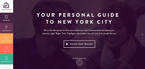
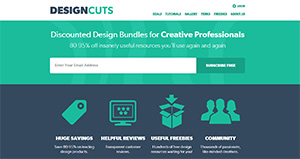
As you get rid of depths from designs, images, icons and other elements become visually simple. Icons have become flat and they are seen in the regular forms of circles, squares and rectangles. Thus you have a more convenient and easy to follow graphic interface. People don’t have to rely on manuals because the visuals speak a story of their own. Check out these four examples of simple but beautiful flat websites.


Typography
It is another important element that is absolutely vast and has lots of constituents to it. The amount of information and details that are part of typography can be huge but they also take a special meaning when it comes to flat design. You have to understand that the conventional serif fonts don’t look very good with flat design. Slab-Serif typefaces like Rockwell or Sanchez, however have their merits for you. There are several modern and simplistic Sans-Serif fonts that are ideal for those who want to use flat design to the fullest. Look at this showcase to get some inspiration for flat web design fonts.
Color options
Colors can have a drastic impact on your web pages and it’s not just about the aesthetics but the feel your users will have about your website. For flat designs candy colors are commonly used because they look more unsaturated and that makes a big difference to the overall appeal of the website. If your website looks too bright, your users are only going to get put off by it. However candy colors make sense because they are easy on the eye and can be complemented with other colors. In order to find the right colors for your project check out the online tool Flat UI Colorpicker
Subtle animations, layers and focus
You can keep things uncomplicated with jump, wiggle or transition, which can show how things work. Literal reinforcement of any particular function is also a good option. Users should have a better idea of the physical space they are navigating through so that they are encouraged to explore more. You can stay in control of things to focus on usability.
Minimalistic approach still works
Ornamental elements don’t have a place in flat design and are better avoided. If there is any aspect that doesn’t have any specific function then there is no reason to add it. You have to remember that if a design is not flashy it doesn’t naturally mean that it is boring. You can use contrasting colors to make illustrations and buttons pop from backgrounds, which can have an eye catching impact on your users. Minimalistic approach can also add to the functional character of a flat design.
Icons
Icons, including glyphs, symbols or large logos are an important element of any design; no two ways about it. They assume further significance in flat design as they can depict the theme of the design. Smaller glyphs and bigger icons tend to work well in this case. But the point to remember is that your icons shouldn’t have gradients and they can have sharp or strong rounded edges. Check out Flaticons to find lots of beautiful free icons for your flat web project.
Consider background patterns
It can be tricky to create bold colored backgrounds and the effort often looks tacky, which is why people tend to use background patterns. But in case of a flat design, your complex background pattern is just not going to work. A slight pattern might be your best ally in the case of flat design or you can use mild texture, which will not be visible from a distance. Your flat design will run the risk of being a regular one if you add complicated pattern to your website. Have a look at Subtle Patterns to find background patterns for your project.
Space
It’s difficult to get space just tight because too much space can make your website look bare while little space makes it look cluttered. It’s always a good idea to subtract rather than add, and you can use all the elements you want at the onset and then cut down till you are left with essentials. Flat designs have open spaces, which is why it’s a good idea to have broad designs.
Images
Using filtered and stylized images have their advantages because they take your message across. Full width images that stretch throughout the page are commonly seen in flat designs while image borders have to be avoided completely.
Flat design can be very simple but creativity is important and it helps to think out of the box. Cuter, sleeker and smarter flat designs are going to be the right way forward for all.
Author Biography
I’m Ramya, a freelance web designer/writer based in India. I have an experience of about 8 years in content writing and have worked for top blogs and websites. I’m generally an extrovert; I like photography, anthropology and traveling to different countries to learn the culture and living of the local inhabitants to do travelogues.
Email: ramyaraju896@gmail.com
Website: www.colorcharacter.com/uk

As a designer the take-away I get from this article and what I notice is that “Clean” is what is in. Flat design may one technical way that a clean design is achieved, but it’s not the only way as “Flat Divides” alludes to in his post. Clean can be done using gradients, shadows, or flat shapes. Apple hasn’t fully embraced “flat” but rather still uses glows, shadows and the like but there design still appears simple, elegant and clean. Microsoft went completely flat in their design rendering but the effect in windows 8.1 in particular is played out as… Read more »
Flat might be the “it” fad of the moment, but it is very polarizing. A vocal subset of developers like the crayon-enspired 1960s design, but not all users are on board. Look at the iOS7 redesign. While not flat, by the strictest sense, it resulted in a pretty large backlash that continues a year later. Windows8 was an amazing failure, despite being the flattest design possib.e I beleive we are just now starting to see a backlash against the web flat design. Pro-flat tends to skew towards a younger demographic, which is great if you want a social site, but… Read more »